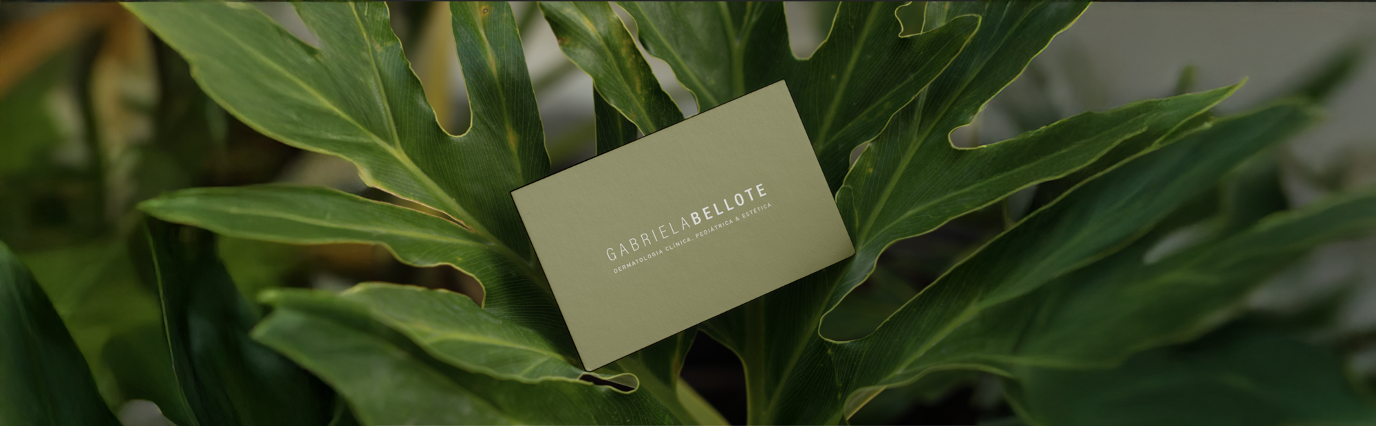
The client sought to reflect in her visual identity the values that guide her services: simplicity, seriousness, and a connection to nature, distancing herself from the traditional trends often associated with aesthetic dermatology. The logo was developed with humanist typography in uppercase, ensuring a composition that balances authority, elegance, and simplicity, with a focus on highlighting her last name. The colors and other branding elements were carefully conceived, inspired by nature, to reinforce the genuine connection and authenticity present in her professional practice.
Gabriela Bellote